Find your visual direction
Describe a subject, setting, light, and mood in your own words. Turn an abstract idea into something your team can discuss.
Try it: turn “a slow summer” into a coastal story.

Turn a spark of an idea into something you can see.
A few words. A new visual direction.
A cinematic coastal story: a woman in the sea breeze, an ocean view from a vintage train, and a winding coastal road. Warm sunlight, 35mm film.
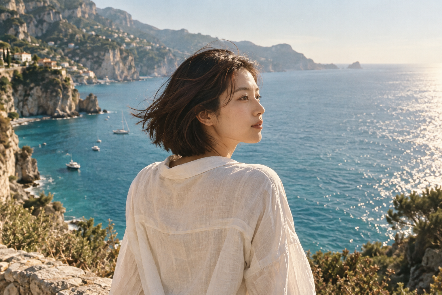
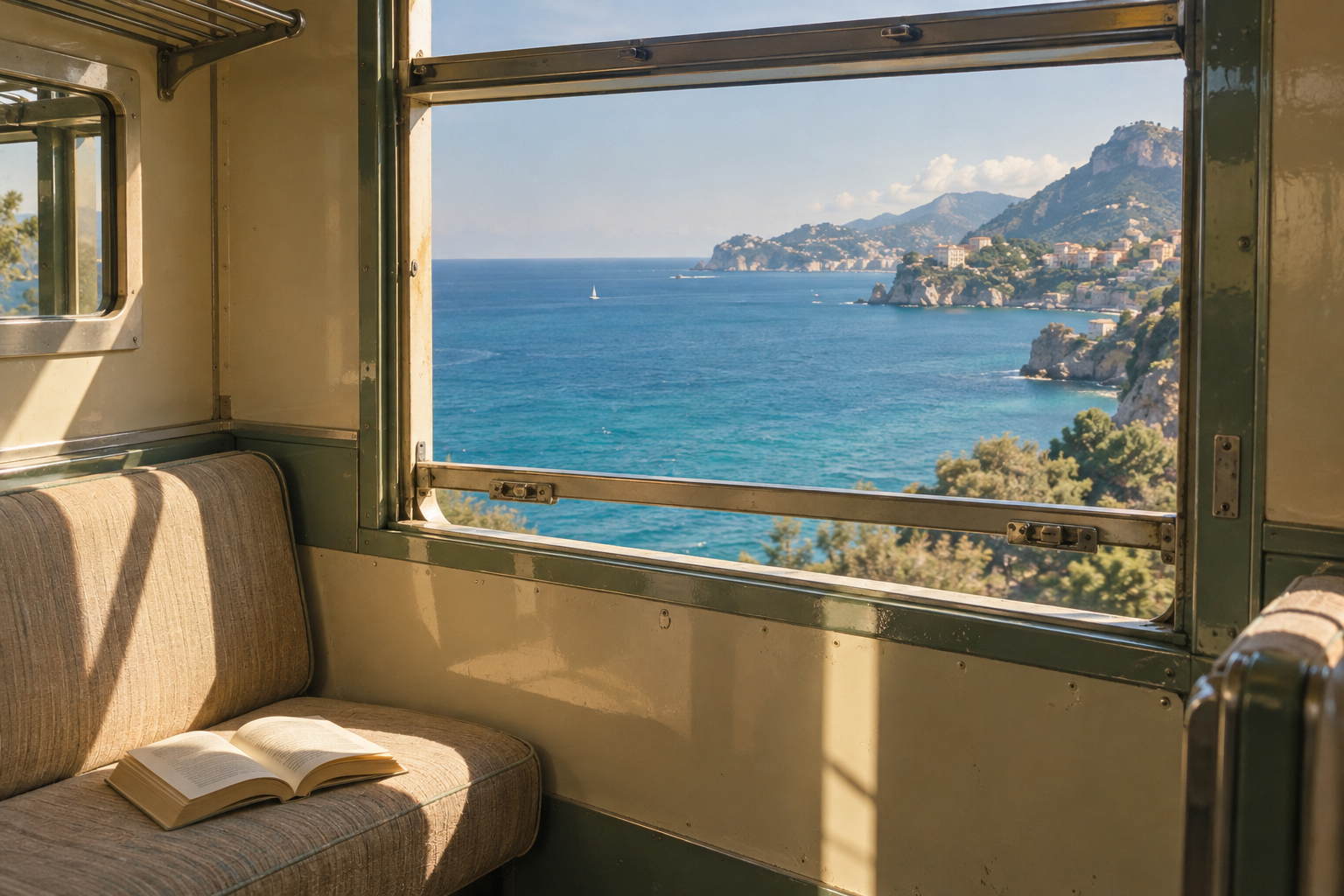
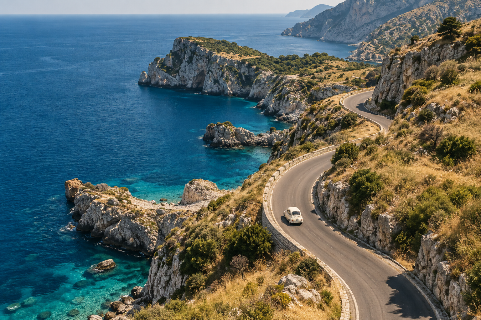
01 / SEE THE POSSIBILITIES
Explore portraits, spaces, cinematic moments, and worlds beyond the everyday.
These AI concept images were created for this showcase to illustrate visual styles. They are not tested outputs from Muse AI.
02 / WHAT YOU CAN DO
Bring the idea. Explore the possibilities.
Spend more time choosing what works.
Describe a subject, setting, light, and mood in your own words. Turn an abstract idea into something your team can discuss.
Move between cinematic photography, considered spaces, dreamlike illustration, and 3D characters to discover the right visual language.
Preview wide, square, and portrait formats. Think through subject placement and room for copy before choosing a direction.
Save favorites, inspect their prompts, and bring useful ideas into your next experiment. Build a collection that reflects your taste.
03 / TRY IT YOURSELF
Write a prompt, adjust the settings, and explore the experience from start to finish.
Coastal stories · Cinematic film · 3:2
A more useful way to promptGo beyond “a beautiful beach.” Try “soft afternoon side light, pale blue water, and subtle film grain.” Specific visual details help express the result you have in mind.
Aspect ratios adjust the preview crop only. Downloads remain 1536 × 1024. Style choices are recorded as demo settings.
04 / FROM IDEA TO FIRST DRAFT
Three steps to explore your first idea, even if you have never used an AI image tool.
YOUR FIRST CREATION
Decide what is in the frame, where it happens, and how the light feels. Build your prompt around subject + setting + light + style. Concrete details communicate more than a long list of adjectives.
Example: A woman with short hair by the sea, wearing a cream shirt, a gentle ocean breeze, warm evening light, 35mm film photography.
05 / FIND YOUR OWN WAY TO USE IT
A cover to design, a pitch to prepare, a new direction to explore. Start with the work in front of you.
Build a visual direction for an article series, a video concept, or a social calendar. Start with the story you want to tell, then explore framing, atmosphere, and a consistent look before committing to final artwork.
Give early creative discussions something concrete to respond to. Explore a few distinct visual languages before refining the preferred direction, so a client or collaborator can react to composition, mood, and texture alongside the written brief.
Connect a campaign message with a visual direction before spending time on final production. Explore how a theme could feel across channels, and give stakeholders a shared reference for discussing tone, subject matter, and space for copy.
Build confidence by observing how words describe visual choices. Study an image you like, identify its light and composition, and turn those observations into a repeatable exercise that helps you understand your own preferences over time.
THE DETAILS THAT MATTER
A PRACTICAL PROMPTING HANDBOOK
A useful prompt reads like a short creative brief: it tells someone what matters in the image and why. Start with a clear subject, then add the few details that shape the result. You do not need a long list of fashionable adjectives. The recipes below show how a setting, a light source, and a composition choice can turn a broad idea into a direction you can discuss, compare, and refine.
Name the main person, object, or scene and describe what it is doing.
Place the subject somewhere specific, with only the surroundings that support your idea.
Describe where the light comes from, how soft it is, and its color.
Use a few tangible details, such as worn wood, matte fabric, or pale stone.
Specify the viewpoint, subject placement, and any space you need for a headline.
Choose a feeling that fits the scene, then remove details that pull against it.
For an editorial portrait, decide how close the viewer should feel to the person. A restrained background and a clear light direction leave more attention for expression. This brief favors a believable moment over a heavily styled fashion scene.
An adult woman with short dark hair stands on a quiet shore in a loose cream shirt. A soft sea breeze moves her hair. Warm late sun lights one side of her face, with pale blue water behind her. Frame from the chest up, eyes near the upper third, with room to the left. Use soft film grain, muted tones, real skin texture, and a calm, candid mood. No text or logos.
Refine one thing: Keep the person, clothing, and setting consistent in your brief while exploring a softer light direction. Check eyes, skin, and the edge of the hair before judging the whole image by its color.
Interior scenes become easier to describe when you establish where the viewer is sitting or standing. The window provides a natural frame, while a small set of materials gives the space a recognizable character without crowding it with decoration.
The inside of an old coastal train, seen from an empty seat by a wide window. Blue sea and a pale sky fill the view outside. Warm sun falls across worn wood, brass trim, and soft green cloth seats. Keep the window frame clear and the horizon level. Use a wide, eye level view with gentle film grain and soft shadows. The mood is slow, warm, and quiet. No signs, text, or logos.
Look for structure: Follow the edges of windows, seats, and wall panels. If the perspective feels confused, simplify the scene description before adding detail. A convincing sense of space matters more than a large number of decorative objects.
A landscape needs a visual hierarchy as much as a portrait does. Here, the road is the subject and its curve creates movement. The coastline, horizon, and open sky support that path instead of competing for equal attention.
A narrow coast road curves above a blue sea, with low green hills on one side and rough pale rocks on the other. View the road from a high path, letting its curve lead the eye into the scene. Soft late sun brings out the grass and stone. Keep the sky light and the sea calm. Use natural tones, fine film grain, and a sense of open space. A tiny pale car follows the bend. No text or signs.
Plan the crop: Decide whether the road should remain visible in a square or vertical layout. Leave breathing room around its most useful curve, and check that the horizon does not cut awkwardly through the intended headline area.
An architectural concept becomes more coherent when its material palette is small. Pair the broad building form with a few surface details and a clear time of day. Treat the result as a visual direction, not as a buildable plan.
A small Mediterranean home looks out over a calm blue sea. Soft white plaster walls curve into broad arches, with pale stone and a warm clay terrace below. Large green leaves frame the view. Show the house from outside at eye level, with clear lines and room around the main arch. Warm sun casts soft shadows across the walls. Keep the scene quiet, open, and natural. No text or logos.
Check the connections: Inspect where roofs, walls, glazing, and stairs meet. Attractive lighting can hide inconsistent geometry. For a presentation, describe the image as a concept reference and separate its atmosphere from any actual design specification.
A fantasy scene still benefits from simple internal rules. Choose one impossible idea, then make the lighting, scale, and arrangement easy to understand. This island has a clear silhouette and a limited set of details that support its gentle mood.
A small island floats in a soft blue sky above a sea of clouds. A tiny cream house and round green trees sit on top of the rock. A curved flight of steps leads out through the mist below. Show the whole island with room around it, seen from slightly above. Use soft peach light, smooth clay shapes, and rich but gentle color. The mood is playful, calm, and full of wonder. No text.
Keep a focal point: View the image at thumbnail size. If the house, steps, and trees all demand attention, reduce the number of details in the brief. A readable silhouette often carries the idea further than extra visual complexity.
For an early character concept, define a memorable shape before adding accessories. The pose should communicate a simple action, and the palette should remain easy to describe. A friendly astronaut cat offers a clear starting point for discussing personality.
A small orange cat in a simple white space suit stands on a pale moon, with one paw raised in a friendly wave. Give the cat round ears, bright eyes, and a clear glass helmet. Use soft 3D forms, a matte suit, and warm rim light. Place the full figure in the center with room above its head and below its feet. Keep the scene clean, cheerful, and easy to read. No text or logos.
Write a character note: Record the features that make the idea recognizable: body shape, suit color, expression, and key accessory. Use that note when evaluating later concepts; a single attractive image does not establish consistency across a series.
FROM FIRST DRAFT TO A USEFUL ASSET
A picture becomes useful when it fits a real task. These sample workflows connect a visual brief to a concrete decision: choosing a cover, aligning a team, or developing a character. Adapt the steps to your own tools and leave room for human editing and review.
A good cover gives the reader a reason to stop without misrepresenting the story. Begin with the article's main idea and the place where the cover will appear, then develop the image and headline as one composition.
Write the article's central point in one sentence. Choose whether the image should explain a subject, suggest a mood, or create a visual metaphor. Note anything it must avoid implying, especially when the story concerns a real person, place, or event.
Decide where the headline will sit before describing the scene. Specify a focal point and a quieter area for type. Record the intended layout, such as a wide newsletter header or a tall social post, so the crop serves the story.
Place candidate images into a simple layout with the actual words. Review them at the size readers will see. A beautiful image may still be the wrong cover if it weakens the title, hides the subject, or suggests the wrong emotional tone.
Make the final crop and add typography in a suitable design editor. Check legibility, export dimensions, and image description text. Keep a note of the source and any editing so another team member can understand how the finished cover was made.
A mood board should help people choose a direction, not simply collect attractive pictures. Organize references around a shared purpose and explain the decisions behind them. The useful outcome is a visual language the team can describe and apply.
Name the audience, communication goal, and intended setting. Choose a few specific qualities, such as calm, tactile, and approachable. Pair each quality with visible cues so everyone understands what it could mean for light, color, composition, and material.
Develop a small set of deliberately different visual briefs. One might use warm natural photography, another simple geometric illustration. Keep the business goal consistent so the discussion focuses on the creative approach instead of comparing unrelated subjects or changing requirements.
Arrange selected references with short notes about palette, surfaces, framing, and mood. Call out which details should influence the project and which are incidental. This helps prevent a team from treating every object in a reference as a requirement.
Record the direction the team chooses and the reasons for it. Translate those choices into a concise style brief with examples and boundaries. Keep unresolved questions visible, and identify which assets still need original photography, illustration, design, or further review.
A character concept needs more than an appealing face. It should express a role, feel appropriate for its audience, and remain recognizable when simplified. Use early images to discuss those decisions before committing to a finished illustration system.
Describe what the character helps people feel or understand. A gentle guide calls for different choices than an energetic game companion. Set the audience, personality, and context first, then choose a shape, pose, and expression that support that role.
Focus your first brief on proportions, silhouette, and a limited palette. Review concepts at a small size and against a simple background. Remove accessories that obscure the face or confuse the outline before spending time on surface texture and decorative details.
Write down the chosen proportions, colors, clothing, and expression rules. If you explore additional poses, compare each image with that description. Treat differences as design decisions to resolve; do not assume that separate images will automatically preserve the same character.
Collect the strongest concept and annotate what should be preserved or corrected. Explain the intended formats, backgrounds, and uses. A designer or illustrator can then develop the required assets, checking consistency and suitability beyond the original concept's single pose.
Give every promising image a second look in the context where it will be used. A focused review helps you separate a strong concept from an asset that is ready to share, publish, or hand to another person.
Compare the image with your original goal, audience, and message. Attractive color cannot compensate for the wrong subject or a visual story that points readers in the wrong direction.
Inspect faces, hands, object edges, perspective, reflections, and shadows. Look closely, then step back. Both local details and the overall arrangement should make sense for the intended scene.
Check for stray lettering, distorted signs, or unintended brand marks. Add important typography in a design editor and proofread it separately, including any words already present in the image.
Compare palette, lighting, subject proportions, and level of detail across the set. Write down intentional differences so a campaign or character series does not drift without a clear reason.
Review each intended format at realistic viewing sizes. Keep essential subjects away from crop edges, check space for interface overlays, and verify that any text remains readable against its background.
Check the applicable tool terms and your source material. Consider recognizable people, brands, and potentially misleading contexts. A generated image alone does not establish permission for every intended use.
06 / START SMALL, CREATE MORE
From occasional inspiration to everyday creative work, explore a plan that fits your pace.
Sample pricing in USD. Choosing a plan will not place an order or charge you.
GET STARTED
Take a look. Get a feel for the creative flow.
No credit card required
For exploring the tool at your own pace
KEEP CREATING
More space for a regular creative practice.
$9 billed monthly
For independent creators and daily content
BUILD YOUR WORKFLOW
Keep bigger projects and teams moving.
$19 billed monthly
For studios, teams, and higher-volume work
All prices, credits, and paid features are examples for this showcase. Membership and payments are not connected. In this concept, one standard image uses one credit; credits refresh monthly and do not roll over. Annual plans are paid in full upfront. Commercial use, cancellation, and refunds would be governed by the live product’s terms.
07 / PRACTICAL ANSWERS
Fourteen practical answers about prompting,
creative workflows, files, privacy, and plans.
Muse AI is a fictional image creation assistant used to demonstrate this reusable tool showcase. The concept focuses on visual exploration: cover ideas, campaign mood boards, composition studies, and early creative proposals. Treat the samples as inspiration, not as evidence of a working generation service. This preview is not suited to producing an accurate product photograph, verifying a real location, or delivering finished brand artwork. Start with a clear brief, use the gallery to discuss possibilities, and choose an appropriate production process for the final deliverable.
No. Begin with one of the example prompts and identify four things: the subject, its setting, the light, and the visual style. Choose a sample you like and describe one reason it works for you. Then try a different aspect ratio and notice what the crop removes or emphasizes. This makes the playground a useful way to practice visual decisions without learning a complex editor. For work you plan to publish, allow time for a separate review of composition, readability, image details, and the requirements of the channel where it will appear.
No. This preview loads preset images. Your prompt, exclusion text, and style choice are demo settings; they do not change the source images or call an AI model. Changing the aspect ratio changes the preview crop, and changing the result count changes how many samples are shown. You can open an image, inspect its example prompt, save it locally, and download the original. A live tool would need a connected model, a real generation request, and its own handling of processing times, errors, usage limits, and output quality.
Write the brief in a useful order: subject, action or pose, setting, light, style, and composition. For example: “A woman with short hair by the sea, a gentle breeze, warm side light, 35mm film photography, subject on the right with open sky on the left.” A newsletter cover may need space for a headline; a character study may need a clear silhouette. Avoid piling up conflicting directions such as both soft diffuse light and harsh midday shadows. Save a simple first version, then make deliberate revisions.
First describe the problem in visible terms. Is the subject too small, the background too busy, the light too dramatic, or the composition unsuitable for your text? Keep the parts that work and change one or two relevant instructions. Keep a note of both the original prompt and the revision. In a live generation tool, compare outputs and review the detail. Here, you can practice writing revisions and inspecting sample crops, but changing the text will not generate a revised image. Use the exercise to develop a clearer creative brief.
Write a short visual specification before drafting individual prompts. Define the palette, lighting, texture, framing, and overall mood that should stay constant. For a coastal series, that might mean warm afternoon light and subtle film grain throughout, with different subjects in each scene. Reuse the shared description. Consistency also needs human review: compare images together and watch for changes in scale, color, and detail. Reference-image or identity controls depend on the live tool you choose. This demo does not include those capabilities or promise matching characters across outputs.
For a production workflow, treat exact text and brand assets as separate items to verify. A visually convincing image does not establish that a headline is spelled correctly, a logo is approved, or packaging matches the real product. Keep essential copy editable in your design or publishing tool, and place authorized logos. When evaluating an image service, test the specific lettering, layout, and product details your project requires. The Muse AI samples demonstrate mood and composition; they do not demonstrate reliable text rendering, logo reproduction, or product accuracy.
Review the image in two passes. First check the story and composition at its intended display size. Then zoom in to inspect eyes, teeth, hands, overlapping objects, clothing edges, reflections, and repeated patterns. Look for details that contradict the scene. For architectural concepts, examine straight lines, openings, and how surfaces meet. A good preview does not replace this review. If something is important to the brief, decide whether it needs correction, a different image, or a separate production method. These checks are a workflow suggestion, not a quality guarantee for the sample tool.
The free demo includes the six-image gallery, interactive controls, prompt copying, local favorites, and original sample downloads. The paid cards describe a concept product: Creator adds a proposed allowance of 200 standard image credits each month, while Pro shows 800 credits and additional workflow features. Sample monthly prices are $9 and $19 respectively, in USD. In this concept, one standard image uses one credit, with allowances refreshing monthly and not rolling over. Generation, cloud history, team features, subscriptions, and payments are not connected. Selecting a paid plan only opens a preview dialog.
The annual examples are $84 upfront for Creator and $180 upfront for Pro, equivalent to $7 and $15 per month. The monthly figure shown after switching to yearly billing is an annual price comparison, not a monthly installment option. A real service would need to state renewal timing, applicable taxes, how cancellation works, when access ends, and the conditions for any refund. No cancellation or refund policy is promised here. Before buying a live product, review its checkout total and published terms rather than relying on these concept cards.
Every sample downloads as an original 1536 × 1024 PNG. Choosing square, portrait, or wide proportions adjusts only the image shown inside the preview frame; it does not create a new file, extend the scene, or increase resolution. Open the image to inspect the full composition before downloading. If your project needs a specific canvas size, crop or lay out the original in an editor and check that the main subject remains visible. This demo does not include upscaling, background extension, transparent-background export, or a promise that a sample is suitable for a particular print size.
Your prompts are used only in the current page experience. This demo does not submit them to an AI model, create an account, or offer cloud history. Saved tool and image favorites use storage in the current browser, so they do not automatically appear on another device or browser profile. Clearing site data can remove those selections. For a future live service, review its specific policies on data retention, deletion, training use, and access controls before uploading material. The privacy behavior described here applies to this interactive demo.
The samples are provided for exploring this showcase and reviewing the concept. This page does not grant or promise commercial usage rights. Before using imagery commercially, confirm the terms of the generation service and any source materials involved, and check whether third-party elements require additional permission. A project involving a recognizable person, a brand, or a product may need a closer review suited to that use. Keep a record of the service, source files, and applicable terms. Download availability, a paid plan, or the absence of a watermark should not be treated as a commercial license.
Agree on the brief before comparing images: audience, message, format, required elements, and what a successful result should communicate. Ask each reviewer to comment on those criteria, rather than only whether they like an image. Label concept work clearly, keep prompts alongside references, and record why a direction was chosen or rejected. This demo can support that conversation through shared links and downloaded samples, but its favorites remain local. It does not provide shared workspaces, collaborative editing, access permissions, or approval history; those are capabilities to evaluate separately in a live team product.
FROM THIS EXAMPLE TO YOUR OWN PAGE
Bring your tool information and images. Help visitors discover your product through a page like this.